
Overview
The Certification Activity Progress Dashboard provides an overview of how the selected team is progressing with certifications assigned to their respective development plans.
Report Elements
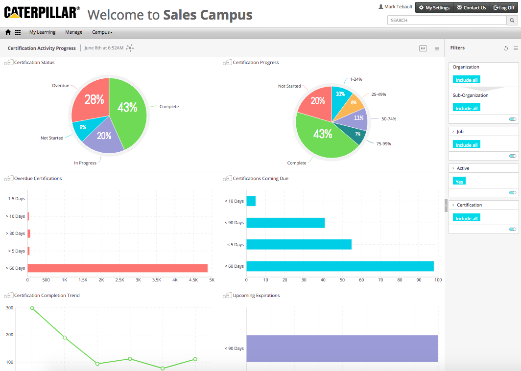
Certification Status
A pie chart widget displays the status for certifications on team members’ development plans.
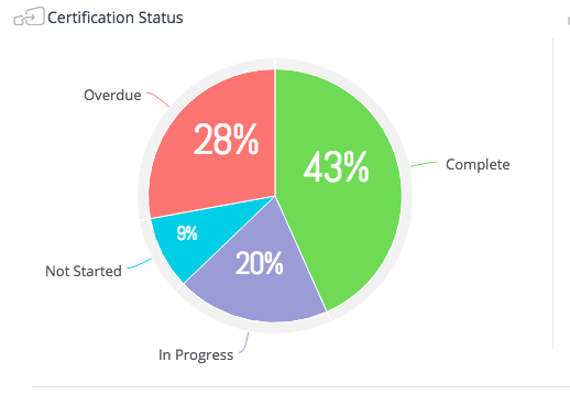
Certification Progress
A pie chart widget displays the progress for certifications on team members’ development plans.
Overdue Certifications
A pie chart widget displays the number of certifications on team members’ development plans that are past their target completion date.
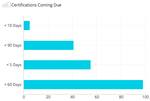
Certifications Coming Due
A pie chart widget displays the number of certifications on team members’ development plans whose target completion date is within the next 5 days, 10 days, 60 days and 90 days. Bars are only shown when there is data to show.
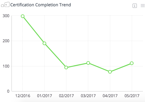
Certification Completion Trend
A line chart widget displays certification completion trend over time.
Upcoming Expirations
A bar chart widget displays the number of certifications on team members’ development plans that are due to expire within the next 5 days, 10 days, 60 days and 90 days. Bars are only shown when there is data to show.
Widgets
Visual elements on the dashboard are called widgets. There are three types of widgets used in this dashboard:
• Pie Chart Widget
• Bar Chart Widget
• Line Chart Widget
Pie Chart Widget
A Pie Chart Widget displays data broken into pieces of the pie. Each piece represents a percentage of the whole pie. For example:
If the widget has this icon in the upper-left corner  then the widget is jumpable. This means the widget can be clicked to filter other widgets on the page, or right-clicked to view the details.
Bar Chart Widget
The bar chart shows data elements as graphical bars. Each bar represents a data point.
If the widget has this icon in the upper-left corner  then the widget is jumpable. This means the widget can be right-clicked to view details.
Line Chart Widget
The line chart shows data elements as a line over time. Data points show monthly by default.
If the widget has this icon in the upper-left corner  then the widget is jumpable. This means the widget can be right-clicked to view details and to change the scale from months to days (and from days to months). Mouse over the data points to see the values for each point.
Comments
0 comments
Article is closed for comments.