
Overview
The User Activity Dashboard provides an overview of an individual user’s activity.
Report Elements
Activity Over Last 6 Months
Label widgets are used to provide general activity information about the user for the last 6
months. These include:
• Total logins
• Total asset hits
• Total certifications completed
• Total curricula completed
• Total online courses started
• Total online courses completed
• Total class registrations
• Total ILT courses completed
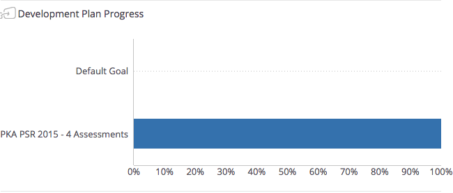
Development Plan Progress
A bar chart widget is used to show progress for each of the goals this user has on her/his
development plan.
Certification Status
A bar chart widget is used to show certification progress for each of the certifications this user
has on her/his development plan.
Curricula Status
A bar chart widget is used to show curricula progress for each of the curricula this user has on
her/his development plan.
Per Month
A bar chart widget is used to show the total logins per month for this user.
Activity Completions
A bar chart widget is used to show the total activities completed from this user’s development
plan in the last 6 months.
Minutes of Training
A bar chart widget is used to show the total minutes of training this user acquired over the last
6 months. Most web-based training (WBT) courses report the time a user spends taking the
course. Instructor-led training (ILT) courses often credit users with hours spent in the training
class. These values are added together for all WBT and ILT courses completed by the user
within each month shown.
Assets Used
A bar chart widget is used to show the total assets the user clicked on within the given month.
An asset is a non-training object such as a document, link, graphic button used as a link, etc.
Widgets
Visual elements on the dashboard are called widgets. There are two types of widgets used in
this dashboard:
• Label Widget
• Bar Chart Widget
Label Widgets
A label widget displays some piece of information. For example:
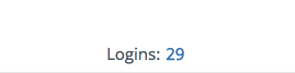
The example above shows there were 29 logins for this user in the given time period.
If the widget has this icon in the upper-left corner  then the widget is jumpable. This
means the widget can be clicked to filter other widgets on the page, or right-clicked to view the
details.
Bar Chart Widget
The bar chart shows data elements as graphical bars. Each bar represents a data point.
The example above shows there were 29 logins for this user in the given time period.
If the widget has this icon in the upper-left corner  then the widget is jumpable. This
means the widget can be clicked to filter other widgets on the page, or right-clicked to view the
details.
Comments
0 comments
Please sign in to leave a comment.